By JAMES ANDRADE
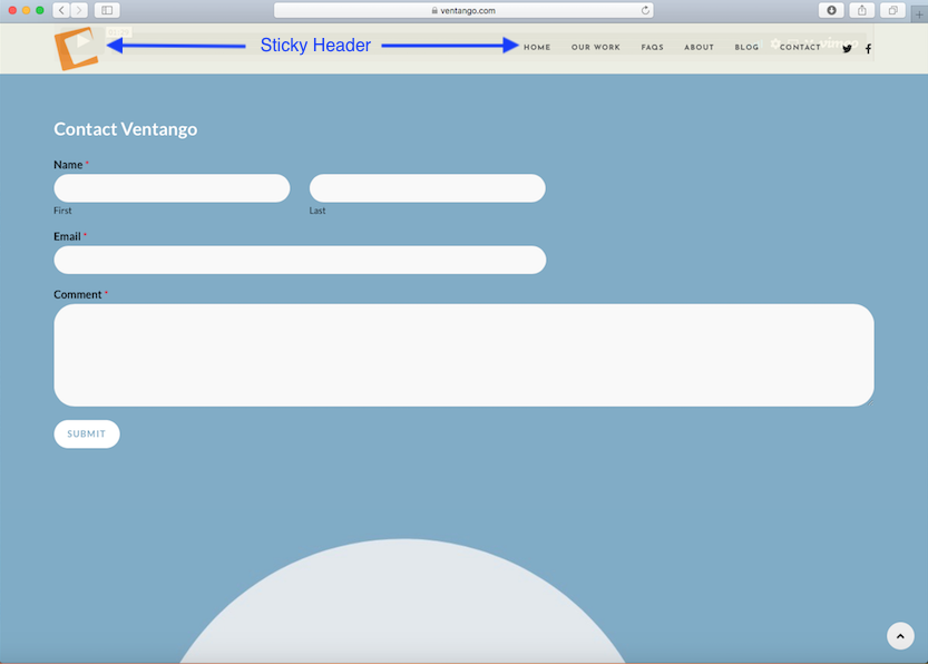
To stick or not to stick: that is the question. Well, as it relates to a sticky header anyway. What’s a sticky header you might ask. You’ve probably noticed on many websites that the header, meaning the logo and the menu, are visible on top of your screen even as you scroll down and all the way to the bottom of the page.
The benefit to this feature is that the user can easily view the menu regardless of what part of the page they’re on and click to visit any page on the site without having to scroll back to the top.
“Remember that the easier you make it for a user to navigate your site, the likelier they’ll stick around.”
This feature/benefit might seem inconsequential but when combined with other elements that make the user experience more intuitive and eliminate additional scrolling or clicks, the user will tend to spend more time reviewing content vs trying to figure out how to get around on your site.
The template that I selected for my website build did not include a sticky header but we easily found a solution. A quick Google search for best WordPress sticky header plug-ins led us to myStickymenu. It’s a great off the shelf solution and very easy to implement. So far, we’re very pleased with the results.


